


The advent of mobile internet has given rise to a new problem for web designers & developers. While they were struggling to address compatibility issues between different browsers, they are now required to develop websites that are compatible with all the latest devices.

There is one option, which is currently being adopted by web designers:
Develop separate websites for mobile devices and computers. These will mean that the same website has different web addresses. And develop a script that detects the device and users are redirected to the respective website version.
This option have their benefits but isn’t completely devoid of issues either.
Firstly, with so many different mobile phones, using varying operating systems ; it can become a task for the script to identify these mobile devices.
Secondly, if you are developing separate website for different mobile and tablet devices, their variety can overwhelm you and increase your expenses quite exponentially.
Responsive Design – The New Reality
Considering the various small and large issues that we face with the existing solutions, responsive designs come across as the future. Under this service, the designer is required to develop a series of scalable designs for different devices. This is made possible by the use of flexible grids and scaling images. Therefore, the UI Design gets considerably augmented and accentuated.
With the help of a CSS element, called Media Query, web browsers can make real time implementations regarding the utmost pixel width that can be supported by them. This number is even useful in making safe assumptions about the mobile devices as the maximum supported number of pixels also gives a suggestion about the mobile devices’ screen width.
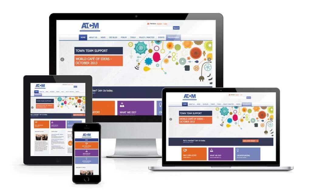
Hence, you are not required to develop different websites for different devices. You can instead design a responsive website that will respond to the screen size of the device and range the layers to offer the best feel for that device.
Media Query
One of the most essential components of designing responsive sites is Media Query.
It is nothing but the breakpoint value, which marks the switch from one device to another. Fluid designs are created accordingly with the objective of fitting into media query’s preset value.
Given that the breaking point is fixed, once it is surpassed another group of CSS values shall be applied and the webpage will be reframed according to the new device’s screen size. This will have a bearing on the text, images and layout. No universal set of breakpoints have been established yet as the concept of designing responsive sites is still new.
After having fixed the range of media query and the breaking points, it is then time to set up the width of the web page. Although the web page shall vary between the fixed ranges, it is still imperative to set the starting point. The simplest way to go about it is to set the lowest range of media query as the width of the content and the layout can later then be fit upward, if the need be.
This rule can have an exception in case of mobile design. In general, with mobile design, the value is assigned to 310; which happens to be the general minimum width for smart phones. In this case, the design should have the room to move both aloft and downhill.
This way of working can be advantageous in many different ways. You can design two mobile websites and merge them together to bring out something new and unique which also offers better performance. Another benefit to the same is that you can decide to add the breakpoints later to make the site fit to much larger screens without it being required to be redesigned again.
One myth about responsive designs is that it is only used for web browsers on the mobile. It is a concept that is used to design websites to fit into different screen sizes and should, hence, be usable for many other platforms too. Take the example of designers who come from the graphic design background. They are used to working with mediums with fixed and limited width like fliers, ads, billboards and others.
At the time of designing responsive sites, the designer has to visualize the tentative look and feel of the size in different widths. Moreover, the adjustment of the navigation should also be thought out comprehensively. One has to understand that controlling the sites would not be a possibility anymore. However, with the help of responsive designs; one can develop beautiful websites for different screen sizes and platforms.
Have a project in mind? give us a chance to work with you. Checkout here to learn more.