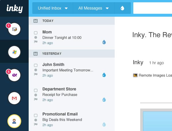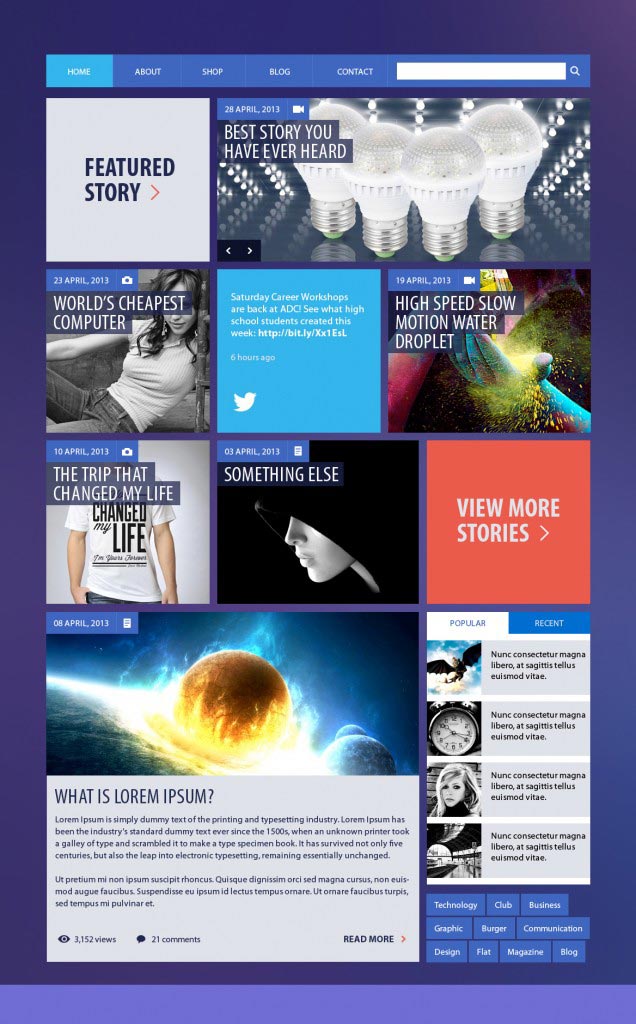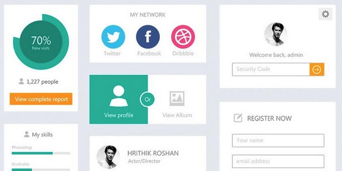
You might have heard this word buzzing around everywhere these days. Windows 8, Android and now iOS7 are using flat design. So what is the flat UI design anyway?
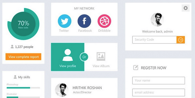
Flat User Interface Design is a new design trend that has simplicity, modernization, and minimalistic design. Flat UI design suggests no use of heavy shadows, textures, patterns, bevels, gradients. These elements are digitally looking as opposed to real world 3d kind of elements. Flat design also suggest use of contrast and strong colors and good typography.
Skeuomorphism

In olden days when computers were introduced there was need to design a UI that relates to the real world objects, so it can make it easier for user to understand. For example, buttons with beveled and embossed effect, file icons that looks like real file etc. That is Skeuomorphism.
As the computers were newely introduced there was it was totally new for the users to use it and hence Skeuomorphism made sense, but we have come a long way after that and almost everybody knows computers now. And that’s the reason why Skeuomorphism is not necessary these days.
So why use Flat Design?
Well, it has number of benefits such as.
- Fast loading, since it has no extra graphic elements such as texture, gradient, shadow etc.
- Cleaner and a reduced amount of visual noise that help improve the usability of website or web application
- Less clutter that help user to focus on the task at hand
- Manages an overload of information effectively
Flat Design Examples

