Regardless of whether you want to create a mobile application for your business or looking to hire a
mobile app design company for the same, it is crucial to have an incredible app design. Mobile application is not just a tool for carrying a business but it plays a pivotal role in taking up your business to the next level. It is a powerful medium that helps you create brand value along with reaching the wider audience across the globe.
So, when you are into the planning stage for your
eCommerce app design, check here some simple hacks that can help you develop an amazing masterpiece.
Focus on Responsive Design
Unless the business is targeting a specific user base, whether only android users or iOS users, focus your design for the responsiveness. Each platform offers varied standards for your mobile app to function aptly. It is crucial to know that as diverse your user base is, the more useful your app will be. Designing an app for everyone is actually an excellent way to increase your app’s reach and therefore increases downloads and shares.
Don’t Miss UX
User experience is the most important part of the designing process. Focusing mainly on the UX during your design process will help you understand the users view point. Therefore, design the app to meet their expectations and needs. An excellent user experience not only helps users to find what they are looking for but also makes the app experience excellent.
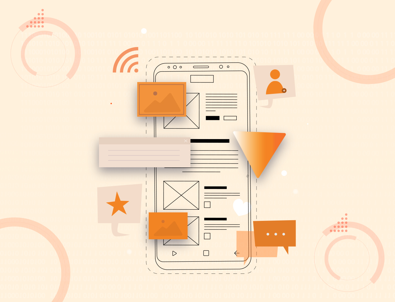
Imply Wire-frame
To keep your customers updated along with keeping UX in mind, it is crucial to use Wire-frame in the
mobile apps design process. Wire-frame is much more than a design tool as it also includes cloud storage and sharing along with minor designing tools.
Use Grid
Everything that relates to design for mobile app development, exists on a grid. It is basic of mobile app design and it guides you to create the best design.
Spacing
Every element in designing is defined by space. Every stroke, dot, line defines the space you have to work with. A seasoned
application designer is well aware of the margins and padding that aids to enhance the design and helps to maintain consistent widths and heights.
Color is Important
Color value is crucial as it defines the purpose. When it is for buttons in an app, be tactful and knowledgeable about what colors make the user click through the button and which color tends to stop them from taking the action. For example, in the US, generally, the bright red prevents users from clicking the button, often thinking they need not use it. The color associations are culturally based and therefore, it needs to be considered important when working for a particular market. Normally, a professional mobile application designer has profound knowledge about such color themes for various markets.
Color also Tells about Brand
Brand is usually focused on the emotional relationship your consumers or customers have with your service or product, it helps to define the relationship more profoundly and in an effective way. Therefore, you need to choose the color accordingly. Let your
mobile app design company choose color representing your brand if you have little knowledge about it.
Avoid Making Irregular Color Decisions
The shading perspectives need to be clear without any clutters. Avoid making varied shades excessively splendid and hard to peruse. Do not try to use bright hues that can hurt the users eyes. Therefore, it is important to utilize the shades that work along with catching up the attention.
Define Elements
If one SHOP button is Green then follow the same for all the screens. Similarly, if one screen has 20 px padding on all four sides, then follow the same standard for the rest of the screens. This helps to maintain consistency and this is what is meant by defining the elements.
Use of Font
Choosing the right fonts is vital. If you’re not aware of the importance of the font then here you get to understand
- Can I easily use it on mobile/web
- Is it legible
- Is there a variety of weights
Though many people are not able to distinguish between various fonts, as long as the typeface is clean and easy to read, it is ok.
UI Helps Keep Things Simple
Designing a good user interface using the minimum style will help to provide better user interface to customers. Keeping things simple helps the first time user of the app to open the app and use it without the need to go through detailed instructions. A simple user interface design will enable the users to perform the multiple tasks using a few simple steps.
Declutter the Elements
Eliminating the unimportant elements is one of the crucial suggestions in mobile UX/UI design development. Decluttering is the most important aspect of the mobile app design that needs to always be taken care of. Every additional shade, element, space, padding, sketch, picture or symbol is going to tangle the screen making it more complex.
So, it is best to have moderate elements with simple shading, which eventually improve appreciation. A straightforward structure will keep users calm with the app.
Screen/Page Titles
Usually, users can easily get lost through the screens in the app. But, the screen titles are efficient ways to help users to know where they are after opening around 40 tabs and don’t recall the content. In apps, sometimes you can skip it if you think your ecommerce app does not require it. Alternatively, you can utilize the space for page titles or search area when the user requires that function.
Wrapping the Mobile App Design Up
By adhering to standard guidelines of UI/UX design, you can craft a user interface that is user-friendly and easy to navigate and understand. Along with these hacks and tips, there are numerous other designing elements that ought to be considered when it comes to mobile apps design.


