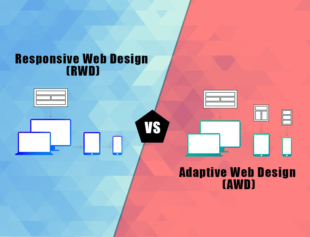
With two prototypes of designing methodologies, coming together, a novel user experience can be heralded. But what comes more surprising is how UI Development service brings in new possibilities for enhancing the user experience to the next level combining the two different designing models – Adaptive and Responsive.
Wondering What All Is Fishing Out Here?
Introducing the Adaptive + Responsive Model
Adaptive and Responsive are the two unrivaled design structures with the common goal of working on the accessibility of a product on devices or screen size, delivering the best user experience to all the varied users. Both methodologies make the best use of available screen space and user interface. But, what comes next is leveraging the potential of both the structures – Adaptive + Responsive. A + R model is outstandingly the most futuristic approach to bring in the best of experience.
Directly jumping onto the A + R model, let’s first explore the arenas of both the methodologies for better understanding and approach.
What is Adaptive Web Design?
As the name suggests, the adaptive web design has a range of distinct layouts for each specific screen size. The layout mostly depends on the screen size. Therefore, considering these various screen sizes in mind, the
user interface developer creates a layout befitting the particular screen size.
What is Responsive Web Design?
On the other side, the Responsive design technique has something amazing to offer. Unlike adaptive, here the design irrespective of any screen size easily slips in, no matter what the target device screen size is. With ‘fluid’ at the core, the design uses CSS media to change styles. This fluid matrix effortlessly allows the page to remold and resize its width and height to adapt the various screen sizes and comes out to be pitch-perfect.
Let’s explore the major techniques used in Responsive Design
Responsive Design Techniques
There are four major approaches that are preferably leveraged by
front end website developer while creating a responsive experience.
Reflow
Developers can easily change the layout structure to better fit the viewport area. Mostly, this leads to the content being stacked, which is usually not acceptable.
Resiz
A few of the UI components are fluid as compared to most of the html elements. They usually fit in the available space and reflow if required.
Show/Hide
Front end developer is aware of the fact that some UI parts are hidden from the viewport, however, they still exist or they just exist there to fill the empty space.
Remodeling
It is a more fruitful approach because, with this approach, it is easy to build and deliver an array of layouts that can bring in the best experience for the specific environment for e. g. a touch only mobile device, or hybrid-touch devices.
Is Responsive Better than Adaptive?
With the differences in their approaches, it is no doubt it is a little difficult task to incline on any side. The major difference is that responsive web design is more into mobile-first responsive web design.
Are you in a quandary which one to choose between the two? Without dwelling deeper, let’s figure it out. It will be easier to put down your choice once you are well aware of the specific devices your site must support. If you think that the iPhone is the only device that matters then it will be a lot easier and convenient to adapt than being responsible for other devices. On the other side, a responsive design, a futuristic approach, is an impact-ful strategy for future-proofing a site from any possibility of device update or unreleased device on the market.
What! When Both Of Them Come Together?
With each having its own limitations and advantages, Front End Website Developer has a better option to choose from – A + R Model. This model combines both the responsive and adaptive approaches based on a single major turning point.
Adaptive + Responsive – What Makes It Unique
Culminating both A (adaptive) and R (responsive) approaches what we get is A + R model. The adaptive technique ushers the developers to work on experiences and functionalities while creating two different contexts. On the greener side, with the responsive approach, one can handle the User Interface UI components and layouts extremely well which is upright inside the contexts.
A + R Model –The Best Reason When to Choose
This unique designing model needs
front end developer designer to deeply understand the user experiences they are considering to provide in order to decide what model to pick on. A + R model fits profusely for magnificent applications that need to be easily accessible from small mobile devices having fewer features, functionalities or having a completely varied structure. It is crystal clear that while getting a lot of flexibility, there also comes complexity because you need to juggle with different codebases and environments, which may not be a compulsion.
Who All Are Impressed And Using This Model?
Wondering how fast
front end web developers have caught up this trend, or who all already are impressed with this incredible model are rolling on it. Well don’t be surprised the successful brands like Twitter, Facebook and GITHub have already brewed on it for their mobile websites. While navigating these popular sites on your mobile device, you will find that it seamlessly changes the user experience according to the smartphone user’s expectations.
would you be able to add Facebook, twitter eg in diagrams if possible
Let’s Keep Exploring More…
Do you have anything unique or unexplored to discuss or do you think we have missed a major aspect? It is always inspiring to know from you when you share.
It is always great to get on conversation, getting to know what others think, their thoughts and views. Indeed, this learning can unravel the unexplored boundaries! So, let’s get going.
For more information
contact us.


